Our New ACT Program: What Happened to Our Checklist Verbiage?

CHANGE IS IN THE AIR
As a user of Method Test Prep’s web-based program, you may have noticed that we’ve released our new ACT app in beta form (distinguished now as “ACT2016-17 BETA” in your checklist navigation menu). The program offers many new and exciting features and improvements, all of which will be detailed by yours truly and my colleague, Andrew Peterson, in an upcoming webinar this month (register here to watch live or receive a recording link).
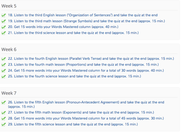
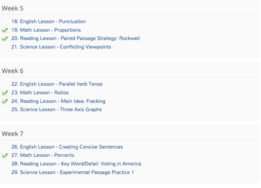
Beyond all of the content-related improvements, we’ve received several questions concerning the checklist’s appearance itself. While we’ve stayed true to the general format students and educators know and love, you’ll notice a stark difference between the verbiage of the tasks.


Old checklist on the left; new checklist on the right
Most of the questions concern why we made this change. The answer is twofold.
(1) Much of the verbiage was redundant. In designing and improving MTP’s web-based app over the years, we’ve kept several key principles in mind, one of the most important of which is time: we know students aren’t going to complete tasks that take an hour. Thus, we’ve always striven to create lessons and quizzes that students can complete in 15 to 20 minutes. It therefore became unnecessary to repeat the “approximate length of time” phrase with each task. While some tasks in the new checklist may take a bit longer, you can rest assured that the vast majority will fall in that same 15- to 20-minute range.
Likewise, there was no need to repeat the “listen to the lesson and take the quiz” verbiage: it should be understood that, to use the program correctly, students ought to complete every lesson, take the accompanying quizzes, and watch the video explanations.
I once had a high school teacher who told the class, “The more you explain, the worse it gets.” We’ve taken this philosophy to heart, paring down the checklist text to get to the core of the content each task will cover, and no more.
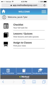
(2) Less text means a cleaner interface. Since the introduction of MTP in 1999, the ways in which all of us interact with digital content have both changed and multiplied. An increasing number of users are accessing our checklists not from conventional desktop computers, but from mobile devices like tablets and phones. With smaller screens comes less room for text, so the less clutter, the better. Abridging the text to show just the lesson types and concepts was the right move to make in order to decrease the amount of scrolling and panning necessary for efficient use of the checklist.
WE WANT TO HEAR FROM YOU!
We encourage you to start using the new ACT program and see all that it has to offer. Send us your comments about the changes you observe!


