Key Changes to This Year's PSAT Score Report

The College Board has made some important changes to its PSAT score report. How does the new score summary present the information? Read more to find out!
I'm always interested in how data are presented and used. What fascinates me in particular is how the former can drastically affect the latter. When a data summary is too broad, it fails to serve one of its key purposes—that is, to offer insight—and holds little value for the interpreter; when a summary is excessively granular, it overwhelms its target with too many numbers and categories to fulfill another of its purposes—that is, to enable people to draw conclusions and derive solutions to problems—discouraging the interpreter from using it at all. Other elements of a report, such as its aesthetics and organization, also hold important sway: all the right numbers lined up in all the wrong ways can make for a useless analysis.
Over the past few years, the College Board—creator and administrator of the PSAT and SAT, among other things—has struggled with how to maximize the usefulness of the PSAT report, which, depending on students' states of residence, has already been released or will soon be released (click here to see when your state's scores will post). As a test prep professional, I know firsthand that, historically, too many students have all but ignored their PSAT results. Of course, the College Board knows this too, and has sought to address the matter. The evidence? Some key changes to this year's PSAT score report.
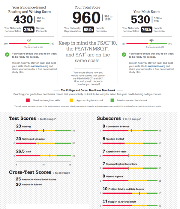
When it revised the SAT and PSAT in 2016, the College Board made it a priority to present students with useful information about their skill sets. By offering data about Subscores and Cross-Test Scores, the College Board hoped to encourage engagement with the numbers, improve understanding of what they meant, and propel students to use them to prepare for the SAT. See the image below for the main page of the PSAT report from 2016 through 2017.

Rich with color and bold typefaces, organized into very distinct sections, and with relatively few distractions, the report provided plenty for students, parents, and educators to analyze. A final page (not shown) listed all of the questions with their correct answers and the students' answers, along with difficulty levels and question categories. Pretty great, right? I have to remember, though, that I'm viewing this through the lens of an experienced professional who deals with the PSAT and SAT daily. Look more closely, and you'll start to see why the report might be far less valuable to the average student. What exactly is Heart of Algebra? Are the Cross-Test Scores actually consequential? What's a nationally representative sample percentile, and what does it mean about my performance? Does this report actually help me do anything? Small text under the main scores at top suggests students go to a link to get a "free personalized study plan," but the offer requires that the students "share" results (i.e., put in effort), and somehow comes off as flat. The report fails to provide clarity or a definite next step.
It turns out that this report often left its recipients with more questions than answers, evidenced by the many phone calls and emails we received from parents who were uncertain as to what it all meant in practical terms. (For this reason, we've run an annual Understanding Your PSAT Results webinar—register for this year's by clicking the link!)
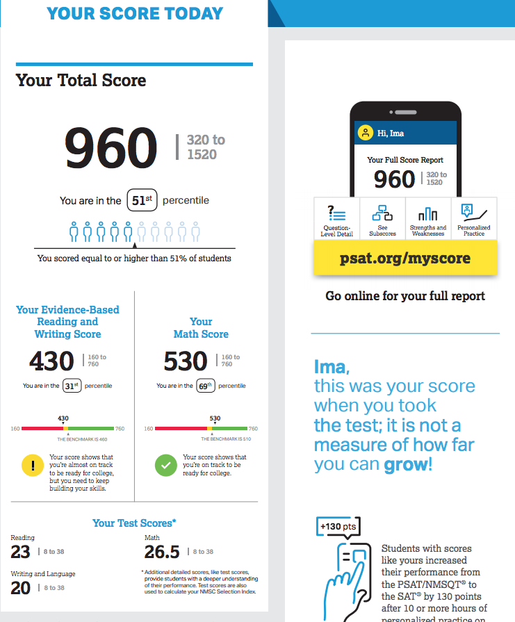
Perhaps the College Board fielded criticism of its report, or did some internal soul searching, but one thing is clear: its content creators understood that the version of the PSAT report shown above wasn't cutting it. We know this because a new report has arrived. Below is a shot of the analogous page of this year's sample report.

The subscores and cross-test scores have disappeared. Notice, too, that the percentile is defined in simple terms so that those who are unfamiliar with the meaning of "percentile" can interpret the number easily. The report provides benchmarks that allow students to see where their scores sit relative to a standard. That's really it. Most striking is that only one half of one page provides all of the data offered. The full remaining half is dedicated to motivating action: a mid-column note emphasizes a growth mindset; a visually stimulating graphic encourages students to follow a link and learn more; a comment at the bottom cites average improvements for students whose PSAT scores were similar. A final page (again, not shown) still provides question-by-question keys and difficulty levels, but eschews confusing content areas.
While it may seem that the College Board has stripped away some potentially useful information from the PSAT report, less is undoubtedly more. By eliminating the subscores, the report's designers delay presenting the valuable insights these numbers provide to a time when they'll be more appropriate and relevant—when the student actually starts working through content to prepare for the SAT. This will increase their impact. Eliminating cross-test scores was a no-brainer: these represented a failed consequence of feature creep, serving as a prime example of infatuation with data going too far and offering too little. (In other words, they were useless.) An absolutely clear call to action urges the logical next step, pushing students to get online, learn more, and start using their results to their advantage. Even the final page that lists answers by question highlights the easiest questions the students answered incorrectly, urging them to pursue the low-hanging fruit to raise their scores.
There's no doubt that the PSAT report and its supplemental data will still be opaque to many. This is okay, and is one of the many reasons why Method Test Prep exists. By and large, though, the simplification and segmentation of the PSAT report is logical and helpful. Whether it's well executed will bear out in students' action, but I applaud the College Board for making the changes, which, when addressed properly, will help students use their PSAT results to greater advantage.

