Your Guide to Viewing Your Students’ Strengths & Weaknesses in Method Test Prep

Method Test Prep’s online ACT and SAT program is much more than merely a vehicle to prepare your students for college admissions tests. The program also makes it very easy to compare your students--on a concept by concept basis--to the hundreds of thousands of other students who are also using the program. You can also easily see which concepts and even which specific question(s) give your students the most (and least) difficulty.
 To compare your students’ work to the rest of the installed user base requires analyzing the “Method Test Prep Norm”, or MTP Norm. The MTP Norm is calculated every night at midnight based on every answer ever made to every question and is a good way of seeing what is “typical” performance.
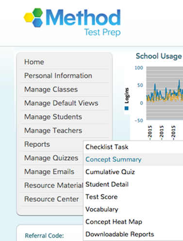
To begin to analyze the data, login to the Method Test Prep program, and use the grey navigation bar to select REPORTS -> CONCEPT SUMMARY as demonstrated in the screenshot below.

You will use this report to see the MTP Norm as well as the questions that your students find to be the easiest and hardest.
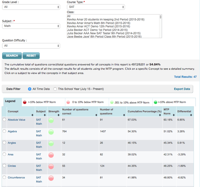
In the screenshot on below, you will notice that the program lets you choose a “Course Type” (ACT or SAT), a subject, a level of difficulty and a grade. You can also search for a particular class if you have created classes to organize your student data.
The screenshot sorts each SAT Math concept alphabetically, but you can sort (or reverse sort) by any column heading. The second column from the right shows the MTP Norm, and the colored dot in the “Strength” column is linked to the MTP Norm: green is better, red is worse. Note that the grey horizontal bar shows us that all of our students have combined to answer 54% of the questions correctly.

To find where your students are having the most and least success, you can click on the name of a concept. Using the same screenshot we just used, I will pick “Algebra”. Our students have answered 764 questions correctly out of 1407, or 54%, which is just about our school average.
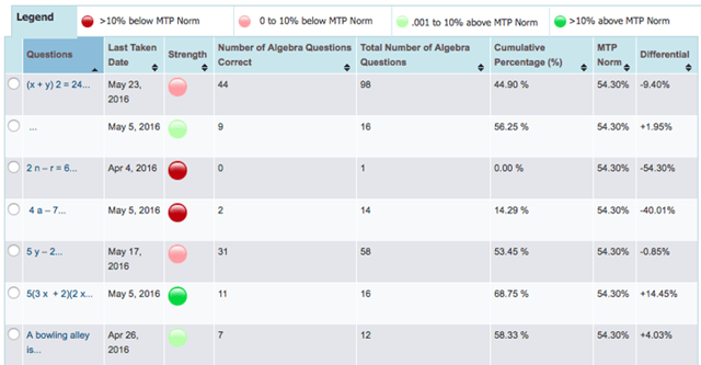
The next screenshot shows even more detail — as you can see, it is possible to see how our students have fared on every question in the program. By clicking the black triangles, I can sort any of the columns, which can help to quickly find the strongest and weakest topics.

If we look at the first question, we can see that our students have only answered it correctly 44 times out of 98, or just fewer than 45% of the time.
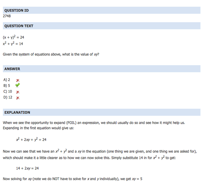
If I click on the question (it’s blue, which means it is a hyperlink), I can see the full text of the question (see screenshot below and to the right), the correct answer, and the full explanation that students are shown after they attempt the question.

Using the Concept Summary Report, teachers can analyze the questions that give students the most trouble to see where to focus their class time, or to help provide an additional window into student performance at your school.
Please don’t hesitate to contact us if you’d like help analyzing data for your school or if you’d like to learn about more of our program’s capabilities.


